What It Is
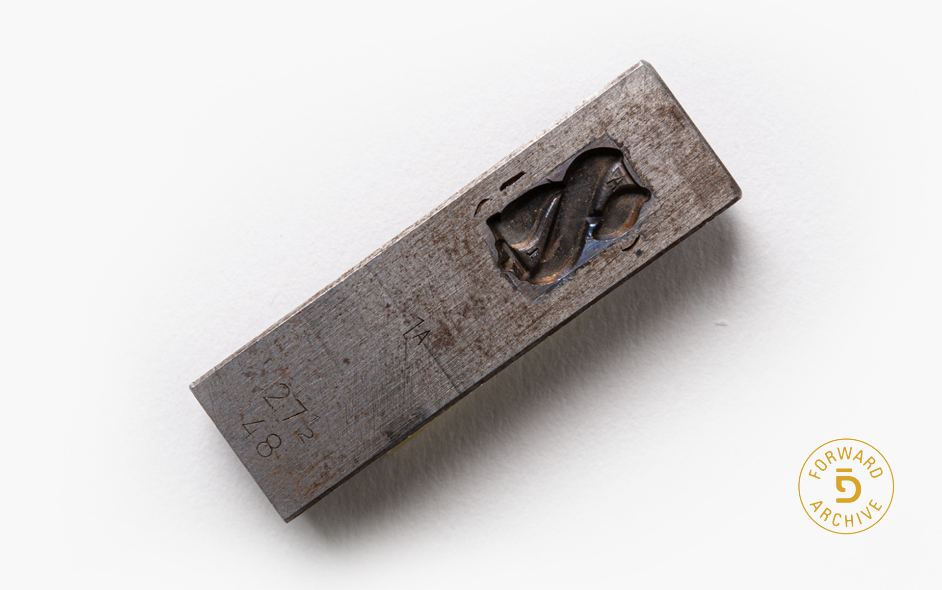
A mold used to create a piece of metal type featuring the Yiddish letter komets alef. There are three different alefs in Yiddish; this one is the second letter in the name Forverts, so it was pretty important. Its size is 48 points, which in printing indicates that it’s large enough for headlines.
Why I Love It
I know. You’re thinking: The name Forverts starts with a fey, so why this devotion for the second letter rather than the first? Well, dear reader, only a few molds for our original Yiddish type remain in our collection, and, alas, none of them are fey. That said, alef is the first letter of the Jewish alphabet in Hebrew and Yiddish, and as such, is typically granted much koved, or respect. This komets-alef seems like it intentionally tarried, wanting to be discovered.
The name Forverts is not especially Jewish — it was inspired by the German social democrat movement’s paper. That grand ol’ fey at the head of our name is a big nod to our progressive ideals, sure. But in the second letter in our name, there's all the Jewish influence you need. If you look closely at the original Forverts logo, you can even see the mighty fey leaning on komets-alef — drawing on it for strength.
A Legacy in Type
Meeting descendants of our former editorial staff is one of my favorite things about being the Forward’s archivist. One of those was Leah Strigler, a teacher, who shared a story about how her father, Mordechai Strigler, gave her a present of her name spelled out in pieces of Yiddish type. It was a particularly moving gift given how expensive metal type could be — so valuable that typesetters heading out for lunch breaks risked having their stash of the more in-demand letters stolen by their co-workers.
Al dos guts/Best,